15 Male Hand Tattoo Design Ideas, Ranked by Visual Balance
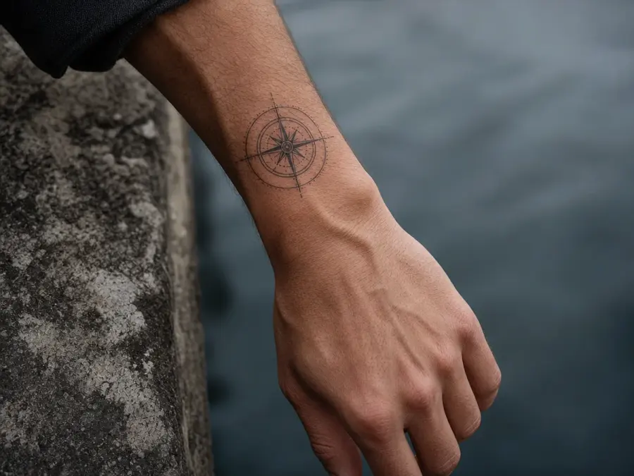
Fine-Line Wrist Compass — Fine-Line Wrist Compass
A compact compass-inspired circle placed just above the wrist crease leads the ranking because it uses a natural transition point and leaves the hand itself open.
Simplified cardinal geometry keeps the concept original and readable. The restrained scale also allows the design to sit comfortably beside a watch or cuff.
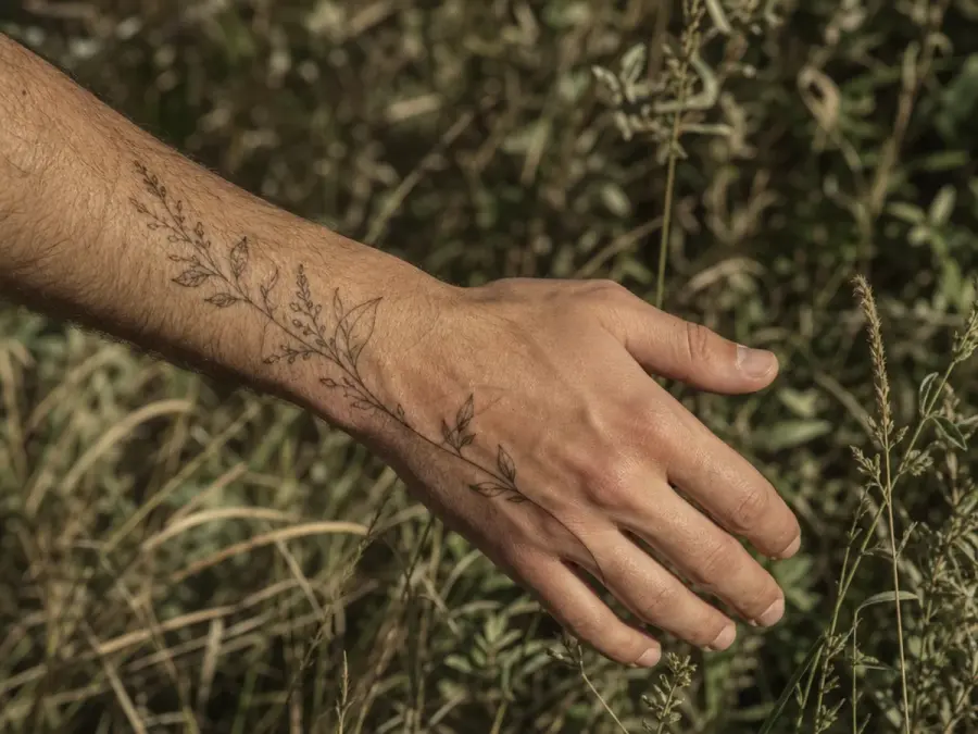
Single Botanical Side Stem — Single Botanical Side Stem
A narrow botanical stem following the outer edge of the hand creates movement without filling the whole surface.
The leaves can change size as they approach the little finger, echoing the taper of the hand. Plenty of untouched skin around the linework keeps the composition calm and clearly defined.
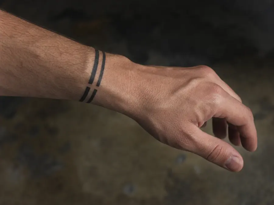
Geometric Wrist Band Break — Geometric Wrist Band Break
Instead of a solid bracelet, this concept uses two slim geometric bands with a deliberate break at the center.
The interruption prevents the design from appearing heavy and gives the eye a focal point. Small variations in line thickness can add depth while preserving the clean architectural character.
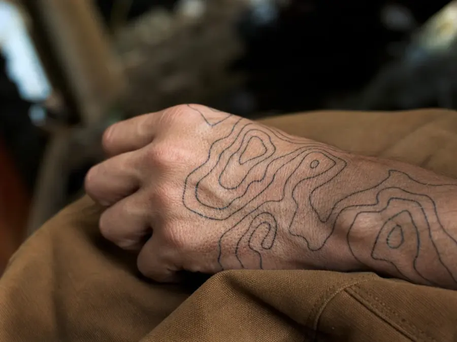
Abstract Topographic Lines — Abstract Topographic Lines
Layered contour lines can flow across the back of the hand like an invented landscape map. Keeping the curves irregular but evenly spaced creates texture without relying on a recognizable symbol.
The pattern is strongest when it follows the hand's long axis and leaves a clear margin around the knuckles.
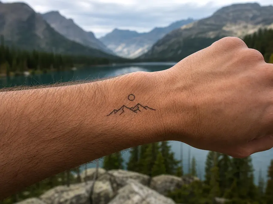
Small Mountain Horizon — Small Mountain Horizon
A low mountain horizon near the wrist offers a landscape idea in a compact format. Use a few uneven peaks, one distant ridge, and a simple sun disc rather than detailed scenery.
The horizontal arrangement creates a stable base and leaves room above it, giving the small image more visual breathing space.
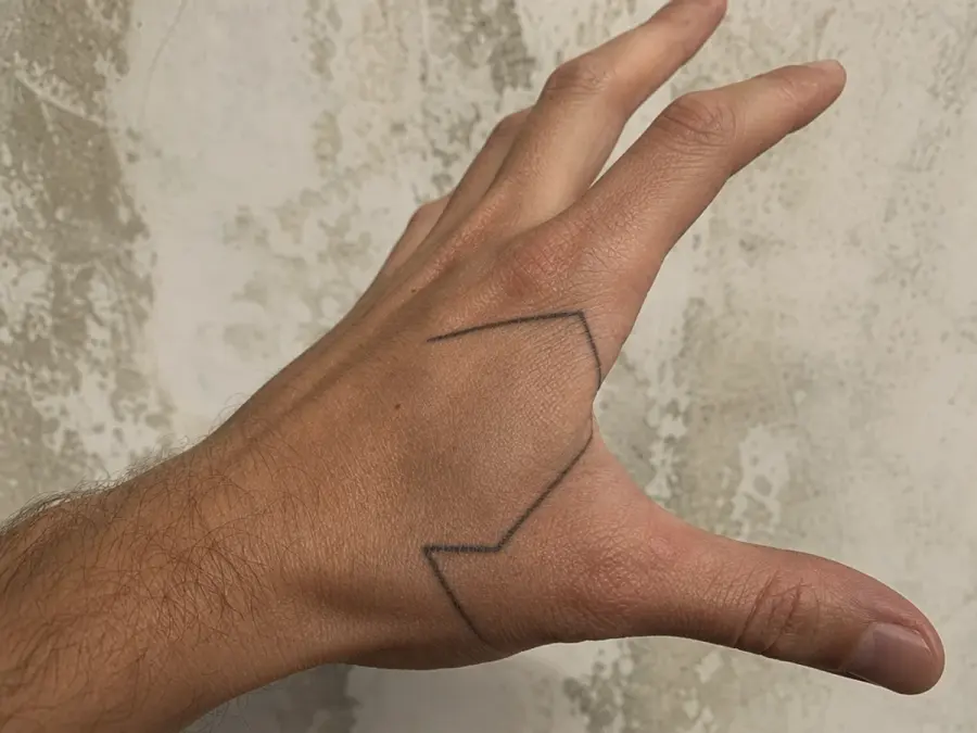
Angular Thumb Frame — Angular Thumb Frame
Two clean lines can frame the base of the thumb without wrapping it completely. The open angular shape highlights the hand's structure and changes subtly with movement.
Keeping the interior blank preserves flexibility, while a slightly heavier outer line gives the simple concept enough presence to remain visible.
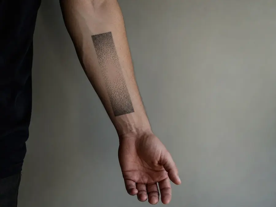
Dotwork Fade Panel — Dotwork Fade Panel
A narrow dotwork panel can shift from dense charcoal near the wrist to sparse points toward the center of the hand.
The gradient supplies depth without a hard edge, while the rectangular footprint keeps it orderly. This idea relies on spacing and tone rather than a borrowed picture or emblem.
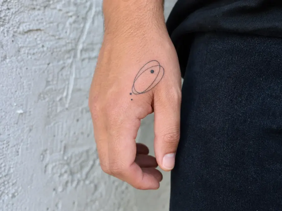
Minimal Orbit Motif — Minimal Orbit Motif
An abstract orbit made from two offset ellipses and three small dots gives the hand a light, modern focal point.
Positioning it between the wrist and knuckles lets the curves sit on a broad surface. The design remains deliberately symbolic rather than depicting a specific planet, logo, or scientific diagram.
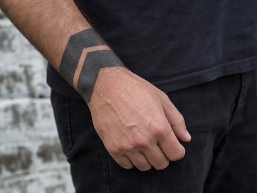
Broken Blackwork Chevron — Broken Blackwork Chevron
A bold chevron becomes more wearable when split by a narrow strip of negative space. The two dark sections point toward the fingers while the break prevents the mark from feeling like one solid block.
Slightly softened corners help the geometry respond to the rounded contours of the hand.
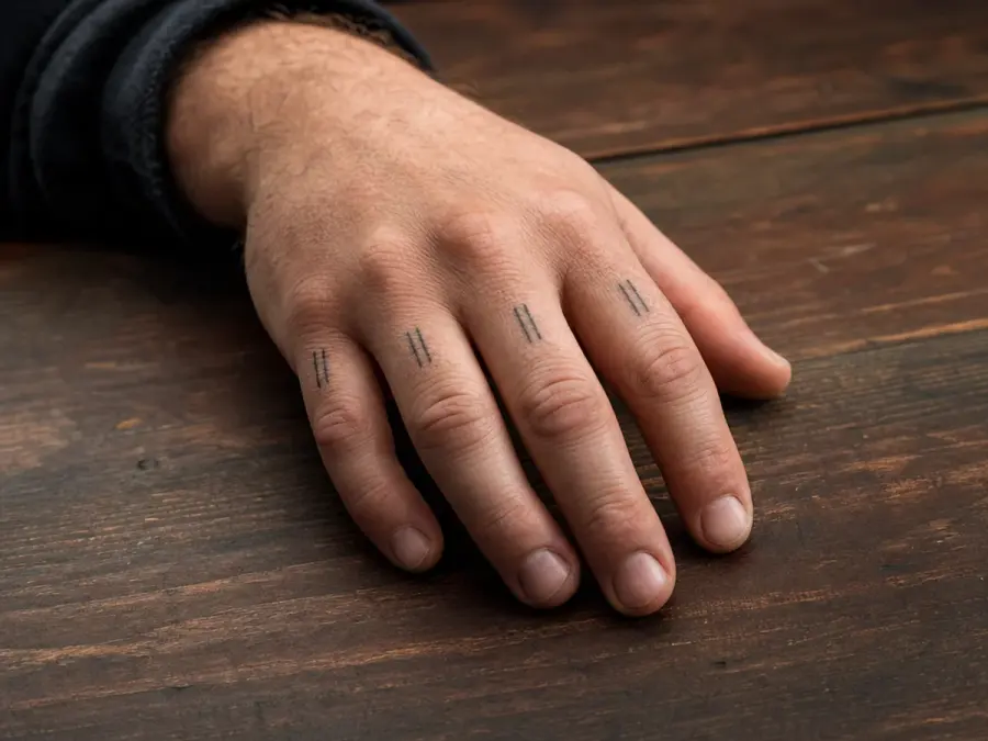
Finger-Base Line Rhythm — Finger-Base Line Rhythm
Four short lines placed below the fingers can create a repeated rhythm without using letters or familiar knuckle symbols.
Vary each line's angle slightly to follow the hand's anatomy, but hold their length and weight close enough to read as a set. The result is graphic yet controlled.

Negative-Space Leaf — Negative-Space Leaf
A dark oval with a leaf-shaped opening uses negative space as the main image. The bold outer field gives the concept weight, while the clean inner silhouette keeps it recognizable and uncluttered.
Placing it closer to the wrist leaves the knuckle area open and gives the composition a clear anchor.
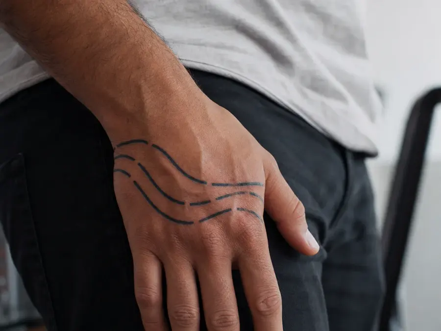
Segmented Wave Line — Segmented Wave Line
A flowing wave can cross the hand in three separated segments, allowing natural gaps to become part of the design.
The broken structure feels lighter than a continuous band and avoids imitating a specific traditional motif. Consistent curve direction ties the segments together when the hand is viewed at rest.
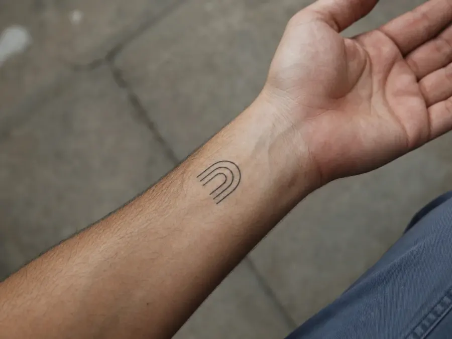
Tiny Architectural Arch — Tiny Architectural Arch
A simple arch built from three lines makes a compact architectural mark near the wrist. Adding one offset inner arch creates depth without introducing detailed ornament.
The design works because its upright proportions echo the length of the hand, while the modest scale leaves space for the skin to frame it.
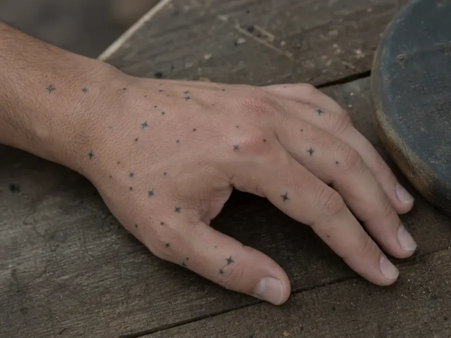
Asymmetrical Star Field — Asymmetrical Star Field
A loose field of tiny four-point shapes can drift diagonally from the wrist toward one finger. Varying the sizes keeps the pattern organic, while limiting the count prevents visual clutter.
The composition should feel like an invented arrangement of light marks rather than a copied constellation or recognizable flag.
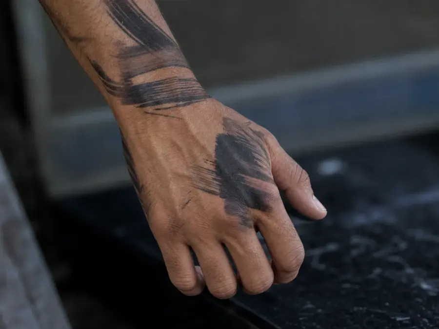
Layered Abstract Brush Mark — Layered Abstract Brush Mark
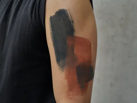
A layered brush-mark concept offers the strongest expression in the gallery. Use one charcoal stroke, one narrower gray stroke, and a small untouched gap so the image has depth and direction.
Keeping the edges original and irregular avoids reproducing calligraphy, a signature, or a familiar painted symbol.
Featured galleries